Symbols of nature, imagination, skeletal forms, and beautiful birds are all intertwined in the brand new visual character of Relentless Energy Drink’s new product packaging – giving each of the five variants visual identity for a new decade.
Through this new artwork the Relentless Energy ethos, ‘No Half Measures’, is brought to life in all five variants with strong references to the tree of life, water, anatomical forms, and the beauty of nature, which are all at constant struggle with one another, but each succeeding in their own way.
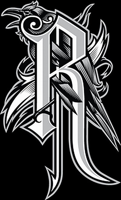
In addition to these ‘Virtues’ visuals, is Relentless Energy’s brand new insignia, which is featured on one side of each can. The ‘R’ entwined with the image of the crow symbolises dark nature, and yet at the same time personifies great beauty.
Sam Grant of Relentless Energy says “The individual artworks are very detailed to help visualise their complicated backstory. Each personifies its own unique identity, bringing to life the virtues of the five variants. While each one is separate, they all flow into the ‘No half measures’ ethos.
For more information please visit the official website.